I’m not a huge fan of banks, but when senior director Michal Panowicz approached me about mBank,
my interest was piqued. How could a banking spin-off of BRE Bank and
founded in 2000 create one of the coolest, most high-tech banking
experiences I’ve seen? The more important question, however, was how
could a Polish bank beat the big guys — the Chases, the Citibanks, and
the Credit Suisses of the world — to the punch in terms of improved user
experience and unique features?
In short, a small group of programmers and finance guys in Warsaw,
Poland, did what the rest of the world couldn’t. And, more importantly,
they were quite successful.
John Biggs interviews Michal Panowicz of mBank from ReaktorWarsaw.com on Vimeo.
MBank, in its current incarnation, is very nearly a startup. While they still get some funding from their parent organization, mBank was designed to be a greenfield operation and work independently from the staid old banks that aggravated customers with long lines and odd rules. Now, however, it’s a snappy, surprisingly usable web-only service that lets customers view their transactions using user-experience rules that are more familiar to Steam users than bank customers.
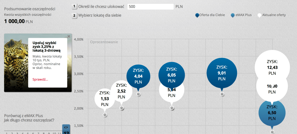
The new mBank is built on a completely responsive design that uses HTML5 and UI tricks to create a unique experience that is more reminiscent of a Windows 8 app than a bank website. While other bank websites show a list of transactions and little else, mBank can show you where those purchases appear in your overall account balance and how and where they fit into your budget. This is done with some clever animations and dynamic objects that are as modern and sleek as an app.


To be clear, banks are still pretty boring. However it’s important that mBank is trying something new. If my own bank, Chase, had something like this — complete with mBank’s gamification aspects, as well as its clever deal offers that mimic the best of Groupon and Pinterest — I’m sure I’d be far more interested in staying on the site. By making the site, for lack of a better word, fun, mBank has changed the relationship between bank and customer. This is important in almost any B2C environment and more important when the traditional customer/business relationship in banking has always been vaguely adversarial. mBank isn’t better, per se, but has done far more about user experience than any other bank I’ve seen. That’s what’s important here — the attention to detail.
I spoke with Panowicz at our Warsaw meet-up and thought it would be interesting to get his input on how to turn a banking website around in a few short years. Panowicz is a former Microsoft employee and a true technophile. He brought a unique vision to a 10-year-old company and turned it around, which is quite important.
Source: Techcrunch, John Biggs
John Biggs interviews Michal Panowicz of mBank from ReaktorWarsaw.com on Vimeo.
MBank, in its current incarnation, is very nearly a startup. While they still get some funding from their parent organization, mBank was designed to be a greenfield operation and work independently from the staid old banks that aggravated customers with long lines and odd rules. Now, however, it’s a snappy, surprisingly usable web-only service that lets customers view their transactions using user-experience rules that are more familiar to Steam users than bank customers.
The new mBank is built on a completely responsive design that uses HTML5 and UI tricks to create a unique experience that is more reminiscent of a Windows 8 app than a bank website. While other bank websites show a list of transactions and little else, mBank can show you where those purchases appear in your overall account balance and how and where they fit into your budget. This is done with some clever animations and dynamic objects that are as modern and sleek as an app.


To be clear, banks are still pretty boring. However it’s important that mBank is trying something new. If my own bank, Chase, had something like this — complete with mBank’s gamification aspects, as well as its clever deal offers that mimic the best of Groupon and Pinterest — I’m sure I’d be far more interested in staying on the site. By making the site, for lack of a better word, fun, mBank has changed the relationship between bank and customer. This is important in almost any B2C environment and more important when the traditional customer/business relationship in banking has always been vaguely adversarial. mBank isn’t better, per se, but has done far more about user experience than any other bank I’ve seen. That’s what’s important here — the attention to detail.
I spoke with Panowicz at our Warsaw meet-up and thought it would be interesting to get his input on how to turn a banking website around in a few short years. Panowicz is a former Microsoft employee and a true technophile. He brought a unique vision to a 10-year-old company and turned it around, which is quite important.
Source: Techcrunch, John Biggs
Aucun commentaire:
Enregistrer un commentaire